Last month, ECE English held its second virtual workshop of the year—this time, on visual rhetoric in the composition classroom. Though we opened our discussion through the lens of teaching infographics, we had a great time talking about the elements of visual design from a number of approaches. Certainly, there are countless ways to challenge your students to think about the importance of visual design in the media they encounter daily and the projects they assemble.
We spoke briefly about the main elements of visual design outlined in the ENGL 1007 curriculum, which include balance, alignment, emphasis, proportion, movement, pattern, contrast, and unity. Here’s a brief video highlighting what each of those elements look like in action.

In my own classes, I often use examples like book covers or movie posters to talk about the relevant elements of visual rhetoric I want my students to wrestle with. (These elements might change depending on the project they’re working on!) It’s always fun to bring in pop culture and pick apart the very deliberate choices that make certain advertisements, posters, illustrations, and packaging so effective.
For example, if I knew my students were familiar with the film, I might show them the poster for Everything Everywhere All At Once and prompt a conversation about what it’s accomplishing in its design and storytelling choices. It’s massively cluttered, yet orderly and symmetrical; what does that suggest about the film’s themes? What motifs are repeated throughout? What images are enlarged (made important), and why? How is the text formatted, and why? What kinds of colors are used? What draws your eye first?
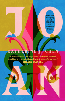
Similarly, I could show them a book cover and have the same conversation. The example I used in March’s workshop was the cover of Katherine J. Chen’s novel Joan. The text and fleur-de-lis are perfectly balanced across four even quadrants, and the font is consistent. Even the color palette follows the same rules: it is inverted across quadrants, but remains the same. This cover also prompts questions about when designers break the rules: what might an asymmetrical design be trying to accomplish? What about unsettling color choices?
This is a great way to generate conversation at the beginning of a visual unit, and it can also be fun to ask your students to bring in everyday examples, as well. Instead of searching for posters or advertisements, have them perform a visual rhetorical analysis on one of their class textbooks, or a poster they saw hanging up in the hall outside of your classroom. As I engage my students in the elements of visual design, I’m also always asking them to consider the rhetorical situation in general, too: what is this text’s overall purpose, and who is the intended audience? How do you know? Is it effective and accessible?
Visual design might not be the first thing we think about when planning a composition class, and we’re certainly not expected to be experts here, but it’s important (and fun, too). I’m reminded of my copy of Toni Morrison’s Song of Solomon, which begins with a note on the type: “This book was set on the Linotype in Janson […] This type is an excellent example of the influential and sturdy Dutch types that prevailed in England up to the time William Caslon developed his own comparable designs from them.” Writing and designing have always gone hand-in-hand, and conversation can be sparked from something as simple as a font in a book. As your students work on their various multimodal projects and you begin thinking about what assignments you’d like to incorporate next year, consider sharing any interesting and exciting conversations you might have with us! You can find a round-up of the workshop’s resources here, on our event page.