Skeptic that I am, the whole business of using infographics in a writing course seemed suspicious, unwelcome when I first considered it. Sure, who doesn’t like to punch up a text with some visual flair or some bold typeface choices. And, yes, I see these things everywhere, often in police stations, post offices, and the dreariest corners of the public library. The term “infographic” is off-putting to me, a space-age portmanteau word not too far from “edutainment” or (*shudders*) “chillax.” Can’t graphics be informational? Isn’t information often in graphic form? Do we need a special word for this? And don’t get me started about the inertness of the word “information,” which too readily suggests frozen over Truth rather than a content to engage with critically.
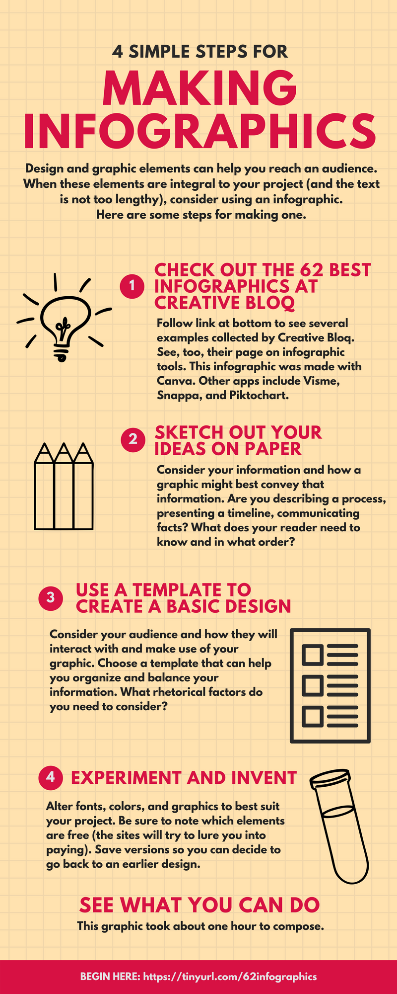
However, at the Digital Media and Composition institute (DMAC, or band camp for writing program administrators), we were introduced to infographics as a mode of composition, and, to my surprise, I quickly became convinced that the very crudeness of the genre could be an asset, that the ham-fisted mechanics of making an infographic via templates might aid rhetorical awareness. That is, because those of us who are not artists or designers require templates—and free ones at that—to make infographics, the almost prohibitive constraints of apps like Canva require a profound awareness of what is not possible. It’s a little like trying to write a paragraph with only the first 12 letters of the alphabet; you can do it, but you’d better put aside your dreams of eloquence. In a strange way, this boxiness is liberating. Our charge is not to teach students professional media skills (heavens, no) but rather to ask what happens when one’s work takes another form. How might you take an aspect of a project you are working on and communicate it to a potentially different audience in this alternate mode?
I’m not a fan of templates, schema, or universal rules for writing. You won’t find They Say, I Say in my teaching toolbox because the last thing I want to do is settle the question of what’s possible. Genre may be built out of expectations, but this doesn’t mean that each new iteration doesn’t in some way revise that expectation. Templates for infographics, especially those on that small list of free models to draw on (steal from), do feel like sturdy, finite forms. But as a single-class diversion from the openness of the ongoing project or as a way to feature rhetorical appeals and design, I think the infographic can work. I look forward to the conversations about aesthetics that this mini-project opens up. And I’m hopeful that some students will have talents in this area that add things to the class beyond my ability to do so.
As the visual designer said to his funding source, “we’ll see.”